We’re going to explore some additions we can make to our website to make it more accessible.
Modulifier is already providing a bunch of accessibility features for us—assuming the “Accessibility” module is enabled.
A quick look at some basic additions to a website to make it more accessible.
We’re going to explore some additions we can make to our website to make it more accessible.
Modulifier is already providing a bunch of accessibility features for us—assuming the “Accessibility” module is enabled.
Remember the purpose of this lesson is to type the code out yourself—build up that muscle memory in your fingers!
Start the lesson by forking and cloning the basic-accessibility repository.
Fork & clone the “basic-accessibility” repo.
The repository will have some starter files to get you on your way and include requirements for Markbot so you can be sure you’ve completed the lesson.
This includes some starter code that you can get by forking and cloning the repository. You’ll use Markbot to double check everything is done properly.
We’re going to start a website from scratch, so we can completely concentrate on just the accessibility.
After forking & cloning the repository, create the following files in your folder.
Let’s add some basic code to the files now.
index.html with the default boilerplate.modules.css file.We’re not even going to bother with a main.css because we’re not going to touch any CSS in this lesson.
You can find the text inside the content.txt file.
Create the boilerplate with html5, viewport & css
The first, most important, thing that helps accessibility is proper semantics. Every website should be sure to use the most appropriate tags where possible.
⋮
</head>
<body>

  <header>
    <h1>Pangolin</h1>
    <nav>
      <ul>
        <li><a href="#">Description</a></li>
        <li><a href="#">Behaviour</a></li>
        <li><a href="#">Conservation</a></li>
      </ul>
    </nav>
  </header>

  <main>
    <section>
      <h2>Description</h2>
    </section>

    <section>
      <h2>Behaviour</h2>
    </section>

    <section>
      <h2>Conservation</h2>
    </section>
  </main>

  <footer>
    <small>© 1821 Pangolin</small>
  </footer>

</body>
</html>
Make sure every, single page has:
<title> — that’s unique to every page<header><nav><main><footer><h1> — that’s unique to every pageIt’s a good idea to link important sections of the document to the navigation, if it’s single page, to make keyboard navigation much better.
⋮
    <h1>Pangolin</h1>
    <nav>
      <ul>
        <li><a href="#description">Description</a></li>
        <li><a href="#behaviour">Behaviour</a></li>
        <li><a href="#conservation">Conservation</a></li>
      </ul>
    </nav>
  </header>

  <main>
    <section id="description" tabindex="0">
      <h2>Description</h2>
    </section>

    <section id="behaviour" tabindex="0">
      <h2>Behaviour</h2>
    </section>

    <section id="conservation" tabindex="0">
      <h2>Conservation</h2>
    </section>
  </main>
⋮
Add ID hash links to the internal page navigation.
Add the matching id="…" attributes to the appropriate sections.
We also need to add tabindex="0" to these elements. This helps keyboard tabbing order by focusing the <section> elements when the links are clicked.
The Web Accessibility Initiative (WAI) has a series of recommendations to make websites more accessible, an important specification is Accessible Rich Internet Applications (ARIA).
One of the major things ARIA adds is a “role” system, where we can define specific elements as being important landmarks on the page.
⋮
</head>
<body>

  <header role="banner">
    <h1>Pangolin</h1>
    <nav role="navigation">
      <ul>
        <li><a href="#description">Description</a></li>
        <li><a href="#behaviour">Behaviour</a></li>
        <li><a href="#conservation">Conservation</a></li>
      </ul>
    </nav>
  </header>

  <main role="main">
    <section>
      <h2>Description</h2>
    </section>

    <section>
      <h2>Behaviour</h2>
    </section>

    <section>
      <h2>Conservation</h2>
    </section>
  </main>

  <footer role="contentinfo">
    <small>© 1821 Pangolin</small>
  </footer>

</body>
</html>
These landmark roles should only be used once per page—only one <header> can be banner, only one <nav> can be navigation, etc.
The masthead of the website should always have the role of banner
The primary navigation should always have the role of navigation
The main content of the page should always have the role of main
The website footer, where the copyright notice, and terms of use, etc. are should always have the role of contentinfo
If the <footer> contains more than just the copyright notice, like social media links, a secondary navigation, contact information, then role="contentinfo" should be on something else that contains only the copyright notice, etc. only
Skip links are hidden links that allow keyboard users to jump to specific points on the page.
Ideally they shouldn’t be hidden, but most picky designers (that’s you) think they’re ugly and want them to be hidden. If they are hidden, it’s extremely important that they become visible when the keyboard navigates to them.
(Modulfier already has skip links built into it.)
⋮
</head>
<body>

  <ul class="skip-links">
    <li><a href="#main">Jump to main content</a></li>
    <li><a href="#nav">Jump to navigation</a></li>
  </ul>

  <header role="banner">
    <h1>Pangolin</h1>
    <nav role="navigation" id="nav" tabindex="0">
      <ul>
        <li><a href="#description">Description</a></li>
        <li><a href="#behaviour">Behaviour</a></li>
        <li><a href="#conservation">Conservation</a></li>
      </ul>
    </nav>
  </header>

  <main role="main" id="main" tabindex="0">
    <section id="description">
      <h2>Description</h2>
⋮
Open the website in your browser and press Tab to navigate around with the keyboard—you should see the skip links pop up when you’re moving around.
Skip links are essentially just a small list of links—but they must be the very first thing inside the <body>
Modulifier has CSS styles for these already that will hide them by default and only show them when the user navigates with the keyboard.
Make sure to add IDs to the appropriate elements on the page.
And also make sure to add the tabindex="0" to help with keyboard focus.
Let’s say that we have an image on our website—but it doesn’t make sense to use a <figure> element, maybe because it’s described much further down the page.
Maybe in this situation, the alt="…" attribute is too limiting: we can’t describe all our content in a single sentence. But it’d still be nice to provide an alternative.
ARIA provides an aria-details attribute that allows us to point to another HTML element for the alt instead.
⋮
<main role="main" id="main" tabindex="0">
  <img src="images/map.jpg" alt="" aria-details="countries">

  <section id="description">
    <h2>Description</h2>

    <div id="countries">
      <h3>Some countries where pangolins are found</h3>
      <ol>
        <li>Botswana</li>
        <li>Kenya</li>
        <li>Mozambique</li>
        <li>Namibia</li>
        <li>South Africa</li>
        <li>Tanzania</li>
        <li>Uganda</li>
        <li>Zambia</li>
        <li>Zimbabwe</li>
      </ol>
    </div>
  </section>
⋮
The new <img> tag here has an empty alt="" attribute and uses the aria-details="…" attribute to point to the ID of an HTML element in another location on the page that describes the image fully.
The element that aria-details="…" points to must have a matching id="…" attribute.
Let’s say we have a few “Read more” links on the page. All the text inside each <a> tag says exactly “Read more” but each link points to a different location.
From an accessibility point-of-view, that’s really confusing because the same text, points to different places.
ARIA provides another attribute for us to give a little extra text to elements to help with accessibility—the aria-label="…" attribute.
⋮
    </ol>
  </section>

  <section id="behaviour">
    <h2>Behaviour</h2>
    <a href="https://en.wikipedia.org/wiki/Pangolin#Behavior" aria-label="Read more about Pangolin behaviour">Read more</a>
  </section>

  <section id="conservation">
    <h2>Conservation</h2>
    <a href="https://en.wikipedia.org/wiki/Pangolin#Conservation" aria-label="Read more about Pangolin conservation">Read more</a>
  </section>
</main>
⋮
The aria-label="…" attribute can be added to elements to give them a better, more descriptive text representation.
Accessibility tools will present aria-label="…" to users instead of the text inside the element.
We don’t actually have to do anything right now. Browsers have default focus states for links and Modulifier changes them to be large black outlines.
Try navigating around the page using the Tab key.
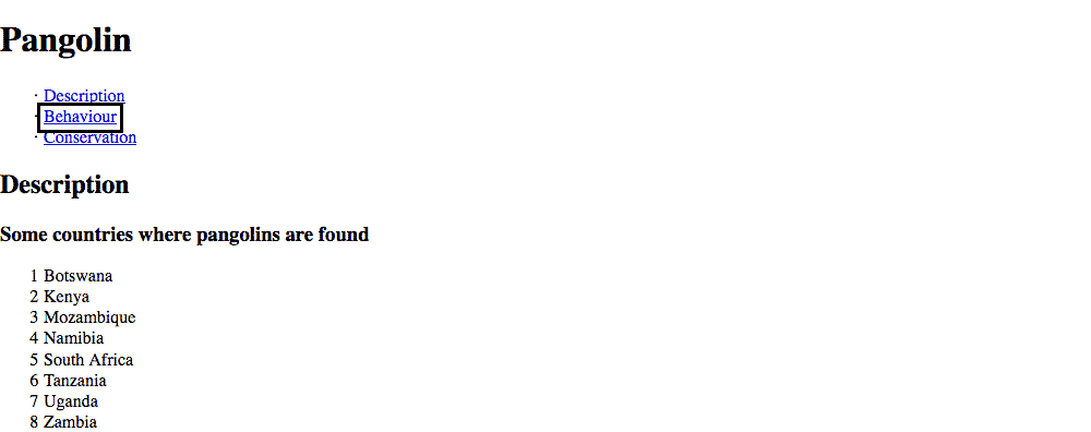
Those black boxes that surround links are extremely important for accessibility access and should never be removed. You’re welcome to style them a little to make sure there’s enough contrast with the background—because black boxes won’t show up on a dark background.
That’s absolutely not all there is to accessibility. Much more testing needs to be done with accessibility validators and tools like VoiceOver.
Drop the final, coded exercise into Markbot and fix all the errors until Markbot gives you all green (and maybe a little yellow).
After you’ve fixed all the problems, go ahead and submit the assignment. You’ll immediately get your grade.