A quick introduction to the CSS Flexbox properties, how they work and what they do.

Go fullscreen: ⌃⌥F

Flexbox

Side-by-side

Use Flexbox to get things beside other things

Like inline-block but more precise

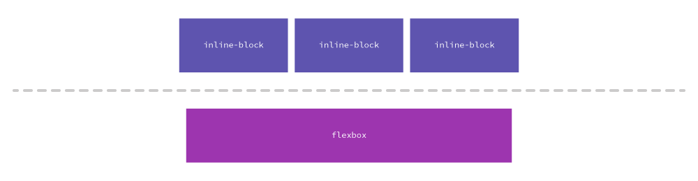
Inline-block will always have a little space between—where flexboxes can touch.

Works on children

Many of the flexbox properties are applied to the parent element, but affect the child elements.

This is different from many other CSS properties that directly affect the selected element.

Flexbox

  • display: flex — turn the system on
  • flex-direction: row — make all the children go side-by-side
  • justify-contents — control the spacing around the children
  • align-items — control the space above/below the children
HTML
<div class="columns">
  <div class="col">Column 1</div>
  <div class="col">Column 2</div>
</div>
CSS
.columns {
  display: flex;
  flex-direction: row;
}
.col {
  background-color: yellow;
}
HTML
<div class="columns">
  <div class="col">Column 1</div>
  <div class="col">Column 2</div>
</div>
CSS
.columns {
  display: flex;
  flex-direction: row;
  justify-content: space-between;
}
.col {
  background-color: yellow;
}
HTML
<div class="columns">
  <div class="col">Column 1</div>
  <div class="col">Column 2</div>
</div>
CSS
.columns {
  display: flex;
  flex-direction: row;
}
.col {
  width: 50%;
  background-color: yellow;
}
HTML
<div class="columns">
  <div class="col">Column 1</div>
  <div class="col">
    <h2>Column 2</h2>
  </div>
</div>
CSS
.columns {
  display: flex;
  flex-direction: row;
  justify-content: space-around;
  align-items: center;
}
.col {
  background-color: yellow;
}
Start

A quick introduction to the CSS Flexbox properties, how they work and what they do.