Floats and clearing are used to allow text to wrap around an object. With more complex usage, floats can be used to create complex layouts, including columns and grids.
Text wrapping with float
The primary purpose of the float property is to allow text to wrap around another element, that element could be an image, a div, or any HTML element.
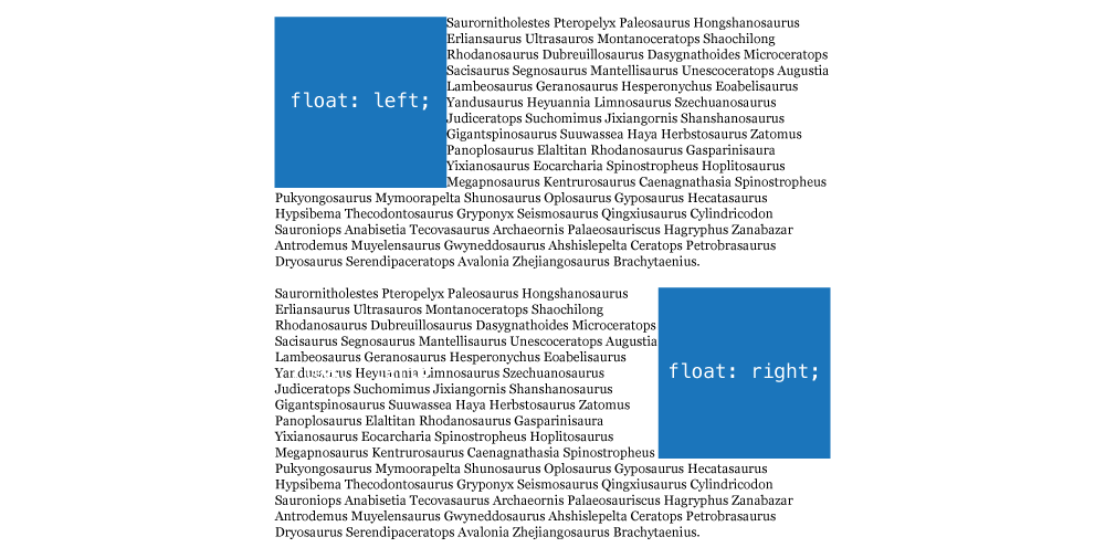
float: left— move the element to the left, allowing text to wrap on the right sidefloat: right— move the element to the right, allowing text to wrap on the left sidefloat: none— would turn floating off
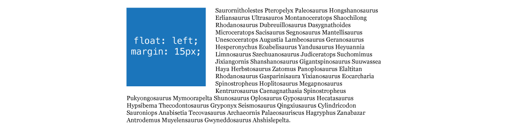
If you want to push the text away from the floated element, margin will work well:
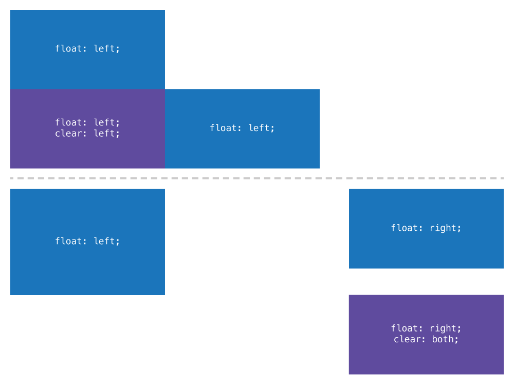
Multiple floats together
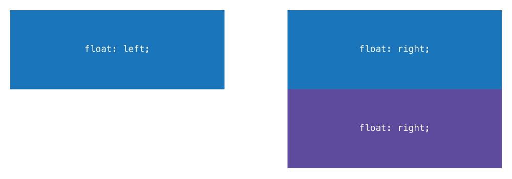
If there are multiple elements together in HTML and they are all floated, the browser will try to fit them on the same line:
<div class="box-1">…</div>
<div class="box-2">…</div>
<div class="box-3">…</div>
.box-1 {
  float: left;
}

.box-2 {
  float: right;
}

.box-3 {
  float: right;
}
Since the width of .box-1 and .box-2 is less than with width of their parent element the can fit on they same line together.
But since there is no space left on that line for .box-3 it will move down to the next line, underneath the other floated right box.
Float & display
After you’ve added the float property to the element, the display property no longer works—float is more powerful than display.
.box {
  float: left;
  display: block; /* This has absolutely no effect on the element */
}
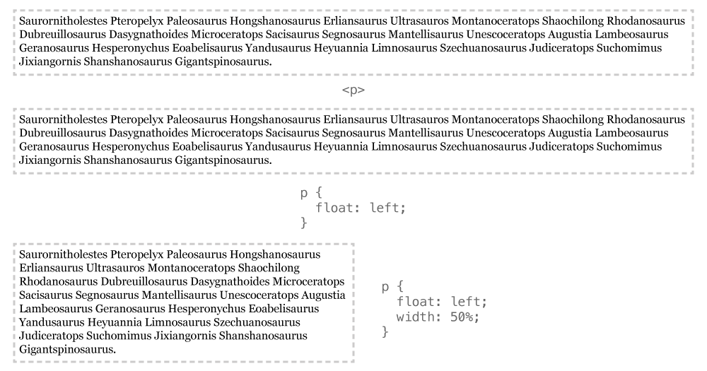
Width collapsing
Similar to inline-block elements, when something is floated it will collapse to be as small as it needs to contain its content.
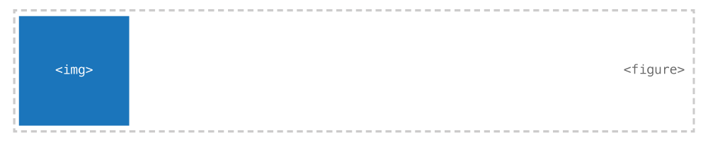
As an example, if you have a figure with an image inside, the figure will collapse to be the width of the image.
It’s very common to add a width to floated elements—especially elements that only have text inside them.
With something like text, the text will always try to fill the whole width, so it’s extremely important to always put a width on floated text.
Float & the flow
Floating only allows the text inside elements to wrap around another element. But the floated element itself is completely removed from the flow, that means that even though the text wraps, the elements ignore the float and exist behind it.
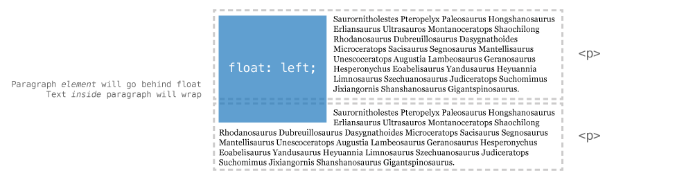
Floated elements are completely removed from the browser’s flow of HTML elements and no longer take up space from an element layout point of view.
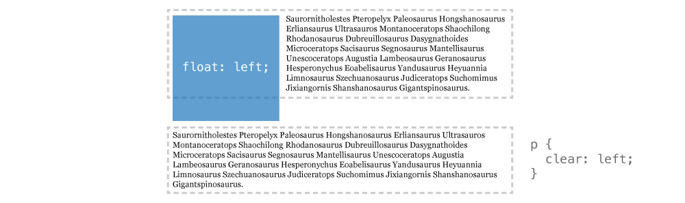
Clearing floated content
Float has a companion property that allows us to force an element underneath other floated elements: clear.
clear: left— go below all left floated elementsclear: right— go below all right floated elementsclear: both— go below all floated elements
In the example above, if we applied clear: left to the second paragraph it would now fall below the floated image.
Clear can be pretty powerful in controlling where floated elements move.
Something that is cleared can also still be floated—clear only forces it below other things that are floated but doesn’t prevent itself from floating.
Making columns
Using floats, we can create columns fairly easily by just floating some elements around.
<header>…</header>
<main>…</main>
<aside>…</aside>
<footer>…</footer>
main {
  float: left;
  width: 70%;
}

aside {
  float: right;
  width: 20%;
}
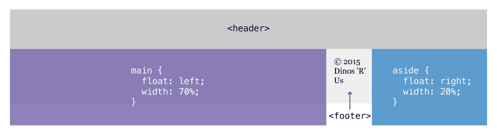
Notice how the two widths don’t add up to 100%—I’ve done that to leave a little space (gutter) between the two columns. But that causes some problems.
Clearfix
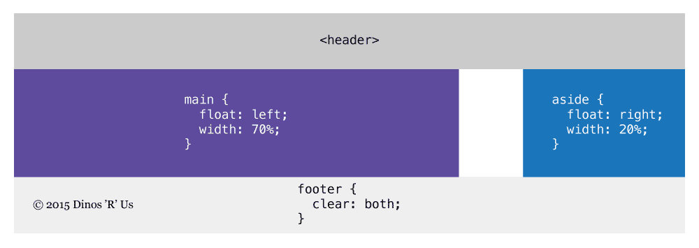
Notice above how the text inside the footer gets all mashed up between the two columns—using clear we can fix that problem.
That’s an okay solution in many situations, but maybe we want the same colour behind both the columns, we’d first have to wrap them in the same element.
<header>…</header>
<div class="wrapper">
  <main>…</main>
  <aside>…</aside>
</div>
<footer>…</footer>
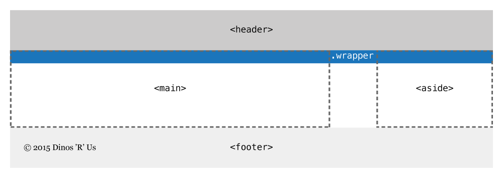
But, because the of the way float works, the .wrapper will not surround the main and aside because they are no longer part of the flow.
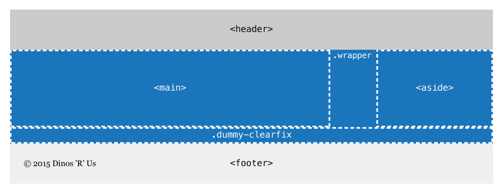
Clearfix with an empty element
This is the easiest way to understand how to fix the problem—but not the best way to do it.
Knowing how clear works, we could just insert another element inside the .wrapper and tell it to clear, forcing the .wrapper to wrap around its floated children.
<header>…</header>
<div class="wrapper">
  <main>…</main>
  <aside>…</aside>
  <div class="dummy-clearfix"></div>
</div>
<footer>…</footer>
If we then added clear: both to the .dummy-clearfix element, our problem would be solved:
.dummy-clearfix {
  clear: both;
}
But this solution isn’t ideal: we don’t want to have an extra element in our HTML for a display issue if we can avoid it.
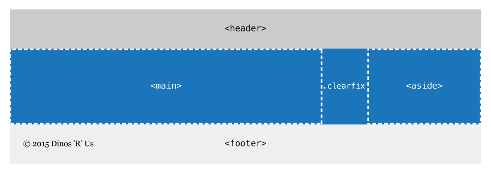
Clearfix class
Instead, we can generate a dummy element using CSS’s :before & :after—then we don’t have to add extra HTML.
<header>…</header>
<div class="wrapper clearfix"> <!-- New second class: .clearfix -->
  <main>…</main>
  <aside>…</aside>
  <!-- No dummy element -->
</div>
<footer>…</footer>
All we have to do is add the following CSS to our file. Then using the class on the parent wrapper element we get our desired outcome.
.clearfix::after {
  /* Generates a new element above */
  content: " ";
  display: table;
  clear: both;
}
Effectively this is exactly the same as using .dummy-clearfix with the benefit of not having to pollute the HTML with extra, unnecessary elements.
Clearfix with overflow hidden
Instead of using the .clearfix, in many situations it’s often just good enough to use overflow: hidden.
So, as another solution to the above problem we could do this:
<header>…</header>
<div class="wrapper"> <!-- No .clearfix class -->
  <main>…</main>
  <aside>…</aside>
</div>
<footer>…</footer>
.wrapper {
  overflow: hidden;
}
Adding overflow: hidden to the .wrapper will totally solve the problem and works in many situations. But overflow: hidden has the side effect of chopping off any child that tries to be displayed outside .wrapper.
Box sizing: border box
When creating floating columns in CSS with width and padding make sure to include box-sizing: border-box or your columns won’t fit on the same line because of the box-model math.
☛ Box model: adjusting layout math with border box
Overflow hidden & floating
overflow: hidden has another interesting side effect: it creates a new positioning context.
Take this example from earlier:
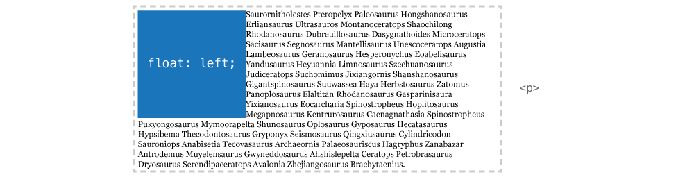
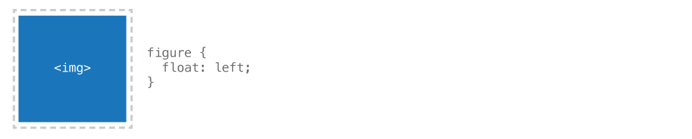
<img src="#" alt="">
<p>…</p>
img {
  float: left;
}
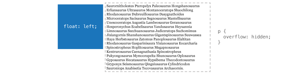
What if we wanted the text to not wrap around the image, but instead create two columns. Following the tutorial above we know that we could just also float the paragraph to create columns.
But, using overflow: hidden on the paragraph we can create simple columns. These aren’t true columns, but more of non-wrapping group. It’s good when you don’t know how wide the image is going to be and you don’t want the paragraph to wrap below it.
p {
  overflow: hidden;
}
Links
Video list
- Float & clear: Introduction
- Float & clear: Wrapped image
- Float & clear: Definition list
- Float & clear: Columns