Using Gridifier

A quick look at using a generated grid from Gridifier in your website to simplify making responsive layouts.

Goal

Gridifier is a tool I created for myself that generates a responsive grid. It was inspired by lots of other grid systems like Bootstrap, Pure.css and Foundation but has it’s own features and doesn’t require you to use the whole framework to implement it in your websites.

Let’s look at how to use Gridifier in your website.

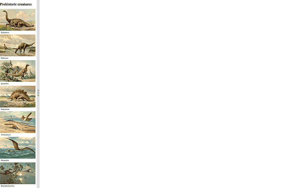
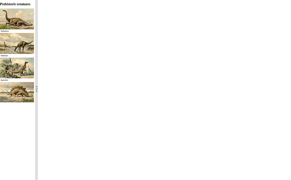
This is what it should look like when it’s done:

  1. Type it, type it real good

    Remember the purpose of this lesson is to type the code out yourself—build up that muscle memory in your fingers!

Fork & clone

Start the lesson by forking and cloning the using-gridifier repository.

Fork & clone the “using-gridifier” repo.

The repository will have some starter files to get you on your way and include requirements for Markbot so you can be sure you’ve completed the lesson.

  1. Fork, clone & Markbot

    This includes some starter code that you can get by forking and cloning the repository. You’ll use Markbot to double check everything is done properly.

1 Set up the project

Before we get started, create some files and get ready.

  1. using-gridifier
  2. index.html
  3. css
  4. grid.css
  5. main.css
  6. images
  7. archeopteryx.jpg
  8. diplodocus.jpg
  9. hadrosaur.jpg
  10. iguanodon.jpg
  11. pteranodon.jpg
  12. rhamphorhynchus.jpg
  13. stegosaurus.jpg
  1. Make an index.html
  2. Make a grid.css in your css folder
  3. Make a main.css in your css folder
  1. Naming conventions

    Don’t forget to follow the naming conventions.

2 Add HTML boilerplate

Use the html5, viewport, and css snippets.

<!DOCTYPE html>
<html lang="en-ca">
<head>
  <meta charset="utf-8">
  <title>Using Gridifier</title>
  <meta name="viewport" content="width=device-width,initial-scale=1">
  <link href="css/grid.css" rel="stylesheet">
  <link href="css/main.css" rel="stylesheet">
</head>
<body>

</body>
</html>
  1. HTML snippets

    Create the boilerplate with html5, viewport & css

  2. Important

    The order of these files is extremely important: grid.css should always come before main.css in the HTML.

  3. Lines G–H

    Don’t forget to attach both CSS files: grid.css and main.css

3 Add CSS boilerplate

Use the cssviewport, borderbox & textsize snippets.

@-moz-viewport { width: device-width; scale: 1; }
@-ms-viewport { width: device-width; scale: 1; }
@-o-viewport { width: device-width; scale: 1; }
@-webkit-viewport { width: device-width; scale: 1; }
@viewport { width: device-width; scale: 1; }

html {
  box-sizing: border-box;

  -moz-text-size-adjust: 100%;
  -ms-text-size-adjust: 100%;
  -webkit-text-size-adjust: 100%;
  text-size-adjust: 100%;
}

*, *::before, *::after {
  box-sizing: inherit;
}

body {
  margin: 0;
}

.img-flex {
  display: block;
  width: 100%;
}

figure {
  margin: 0;
}

figcaption {
  padding: .5em;
}
  1. CSS snippets

    Create the boilerplate with cssviewport, borderbox & textsize

  2. Lines X–AA

    Make sure to add the class for scalable images.

  3. Lines AC–AI

    We’re going to use the <figure> tag when we write our HTML, so let’s just clear out some of the defaults for it right away.

4 Add content to the HTML

Let’s add all the content we need to the HTML including the basic tags.

⋮
<body>

  <h1>Prehistoric creatures</h1>

  <div>
    <div>
      <figure>
        <img class="img-flex" src="images/diplodocus.jpg" alt="">
        <figcaption>Diplodocus</figcaption>
      </figure>
    </div>
    <div>
      <figure>
        <img class="img-flex" src="images/hadrosaur.jpg" alt="">
        <figcaption>Hadrosaur</figcaption>
      </figure>
    </div>
    <div>
      <figure>
        <img class="img-flex" src="images/iguanodon.jpg" alt="">
        <figcaption>Iguanodon</figcaption>
      </figure>
    </div>
    <div>
      <figure>
        <img class="img-flex" src="images/stegosaurus.jpg" alt="">
        <figcaption>Stegosaurus</figcaption>
      </figure>
    </div>
  </div>

</body>
</html>
  1. Line I

    Don’t forget to add the .img-flex class to all the images.

5 Add the Gridifier CSS

We’re going to use Gridifier to generate a fully complete grid for us to use in our website.

Go to Gridifier.

Keep all the settings as their defaults.

Copy all code generated by Gridifier, in the right-hand panel & paste it into your grid.css file.

That’s it—we have a fully functional grid. Now we can concentrate fully on our layout and write much less CSS.

We should never touch the generated CSS just in case we want to replace it later.

6 Add the classes to the HTML

Now that we have a copy of Gridifer, we’re done with CSS. We can move on to putting the right classes into our HTML.

⋮
  <h1>Prehistoric creatures</h1>

  <div class="grid">
    <div class="unit xs-1 s-1-2 m-1-2 l-1-4">
      <figure>
        <img class="img-flex" src="images/diplodocus.jpg" alt="">
        <figcaption>Diplodocus</figcaption>
      </figure>
    </div>
    <div class="unit xs-1 s-1-2 m-1-2 l-1-4">
      <figure>
        <img class="img-flex" src="images/hadrosaur.jpg" alt="">
        <figcaption>Hadrosaur</figcaption>
      </figure>
    </div>
    <div class="unit xs-1 s-1-2 m-1-2 l-1-4">
      <figure>
        <img class="img-flex" src="images/iguanodon.jpg" alt="">
        <figcaption>Iguanodon</figcaption>
      </figure>
    </div>
    <div class="unit xs-1 s-1-2 m-1-2 l-1-4">
      <figure>
        <img class="img-flex" src="images/stegosaurus.jpg" alt="">
        <figcaption>Stegosaurus</figcaption>
      </figure>
    </div>
  </div>

</body>
</html>

Now that we’ve added all those classes we should have a responsive layout.

Check it out in your browser—it should look like this:

  1. Line D

    We first need to add the .grid class to an element surrounding all the units.

  2. Line E

    We’re specifying 4 different sizes on the .unit:

    • xs-1 — Full width on extra small
    • s-1-2 — Half width on small
    • m-1-2 — Half width on medium
    • l-1-4 — Quarter width on large

7 Add another row

This is up to you! Add another brand new .grid row to the bottom of the HTML that has the 3 air dinosaurs.

Inside the new .grid, there should be <div> and <figure> tags for these remaining images:

  • archeopteryx.jpg
  • pteranodon.jpg
  • rhamphorhynchus.jpg

Check out the screenshots folder in the repo you forked to see what the final layouts should look like.

Add the correct grid sizes to each of the remaining units. Gridifier already supports those layouts so you won’t have to change any CSS.

Drop it into Markbot & submit

Drop the final, coded exercise into Markbot and fix all the errors until Markbot gives you all green (and maybe a little yellow).

After you’ve fixed all the problems, go ahead and submit the assignment. You’ll immediately get your grade.

  1. Submit

    Whenever you’ve passed all Markbot’s specific tests go ahead and submit this lesson for marks.