We’re going to explore how to use & change the default buttons provided by Modulifier.
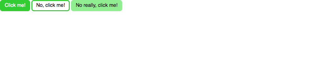
This is what it should look like when it’s done:
Explore how to use and change the default set of buttons provided by Modulifier.
We’re going to explore how to use & change the default buttons provided by Modulifier.
This is what it should look like when it’s done:
Remember the purpose of this lesson is to type the code out yourself—build up that muscle memory in your fingers!
Start the lesson by forking and cloning the button-systems repository.
Fork & clone the “button-systems” repo.
The repository will have some starter files to get you on your way and include requirements for Markbot so you can be sure you’ve completed the lesson.
This includes some starter code that you can get by forking and cloning the repository. You’ll use Markbot to double check everything is done properly.
Before we get started, create some files and get ready.
index.htmlmodules.css in your css foldermain.css in your css folderDon’t forget to follow the naming conventions.
Use the html5, viewport, and css snippets.
<!DOCTYPE html>
<html lang="en-ca">
<head>
  <meta charset="utf-8">
  <title>Button systems</title>
  <meta name="viewport" content="width=device-width,initial-scale=1">
  <link href="css/modules.css" rel="stylesheet">
  <link href="css/main.css" rel="stylesheet">
</head>
<body>

</body>
</html>
Create the boilerplate with html5, viewport & css
The order of these files is extremely important: modules.css should always come before main.css in the HTML.
Don’t forget to attach both CSS files: modules.css and main.css
We’re going to use Modulifier to generate a bunch of common patterns for us to use in our website.
Select all of the different modules.
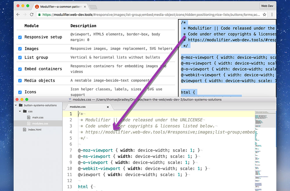
Copy all code generated by Modulifier, in the right-hand panel & paste it into your modules.css file.
That’s it—we have a fully functional pattern library. Now we can concentrate fully on our layout and write much less CSS.
We should never touch the generated CSS just in case we want to replace it later.
Let’s add all the content we need to the HTML for some basic buttons.
⋮
<body>

  <a class="btn" href="#">Click me!</a>
  <a class="btn btn-ghost" href="#">No, click me!</a>
  <a class="btn btn-light" href="#">No really, click me!</a>

</body>
</html>
Refresh in your browser to see the default styles of buttons the Modulifier has applied.
I’ve gone ahead and added the default button classes to these tags. There will be some default styles applied from Modulifier.
Now, we can do some customizations of the buttons inside our main.css file.
It’s really important to notice that main.css doesn’t have our boilerplate code anymore—Modulifier is adding all the code for us.
html {
  font-family: sans-serif;
}

.btn {
  background-color: limegreen;
  border-color: limegreen;
}

.btn-ghost {
  background-color: transparent;
}

.btn-light {
  background-color: lightgreen;
  border-color: lightgreen;
}
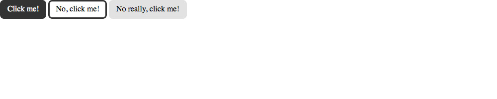
Refresh in your browser and see customized buttons inherited from the Modulifier defaults.
Notice that there is no boilerplate at the top of this file—Modulifier is adding it for us.
Change the default font to sans-serif for the whole design.
Because we are inheriting from Modulifier’s CSS we only need to specify the properties that are different.
We only want to change the button colours, so we only need to specify background-color and border-color
Even though the .btn-ghost is very similar to the standard .btn, since it always has the .btn class, the CSS that we wrote above will overwrite .btn-ghost. So, we need to reset some properties back to their default styles.
Now that we have slightly customized versions of the default buttons let’s add some customized hover states to the buttons.
⋮
.btn-light {
  background-color: lightgreen;
  border-color: lightgreen;
}

.btn:hover {
  background-color: darkgreen;
  border-color: darkgreen;
}

.btn-ghost:hover {
  background-color: transparent;
}
The .btn hover CSS will apply to all 3 buttons, but I don’t want the .btn-ghost to be filled in on hover, only the border to change, so we have to overwrite the background-color for .btn-ghost:hover back to transparent.
Go try it out in the browser!
Drop the final, coded exercise into Markbot and fix all the errors until Markbot gives you all green (and maybe a little yellow).
After you’ve fixed all the problems, go ahead and submit the assignment. You’ll immediately get your grade.