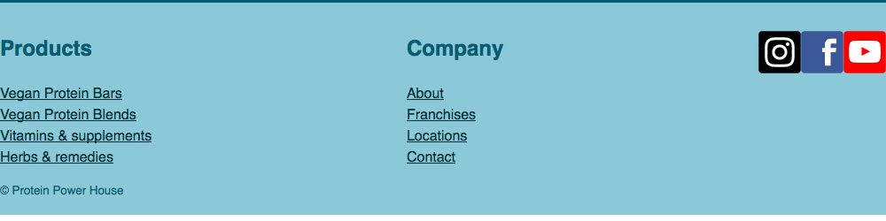
We’re going to walk through writing some HTML and CSS, then use some flexbox, to create a common footer pattern.
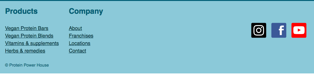
This is what it should look like when it’s done:
Follow this lesson to learn some flexbox techniques to apply to different layouts.
We’re going to walk through writing some HTML and CSS, then use some flexbox, to create a common footer pattern.
This is what it should look like when it’s done:
Remember the purpose of this lesson is to type the code out yourself—build up that muscle memory in your fingers!
Start the lesson by forking and cloning the flexing-your-muscles repository.
Fork & clone the “flexing-your-muscles” repo.
The repository will have some starter files to get you on your way and include requirements for Markbot so you can be sure you’ve completed the lesson.
This includes some starter code that you can get by forking and cloning the repository. You’ll use Markbot to double check everything is done properly.
After cloning the repo to your computer we need to create the default files.
index.html file in your flexing-your-muscles folder.css in your flexing-your-muscles folder.main.css in your css folder.Don’t forget to follow the naming conventions.
Use the html5, viewport and css snippets.
<!DOCTYPE html>
<html lang="en-ca">
<head>
  <meta charset="utf-8">
  <title>Flexing your muscles</title>
  <meta name="viewport" content="width=device-width,initial-scale=1">
  <link href="css/main.css" rel="stylesheet">
</head>
<body>

</body>
</html>
Create the boilerplate with html5, viewport & css
Don’t forget to attach the CSS file.
Use the borderbox snippet. Then add a few more of the default CSS lines we’ll need.
html {
  box-sizing: border-box;
  font-family: sans-serif;
  line-height: 1.5;
}

*, *::before, *::after {
  box-sizing: inherit;
}

body {
  margin: 0;
}

img {
  display: block;
  width: 100%;
}
The border-box system changes the browsers layout math to include the padding in the width—the default is more difficult to manage when making flexible, responsive websites.
Create the boilerplate with borderbox
Don’t forget to add a font-family to the top, in the html element.
For now, we’re going to add a line-height of 1.5 to all our websites—at least until we start doing responsive websites with media queries.
Let’s write all the necessary HTML the website footer and then we’ll move on to doing the flexbox CSS to make it look how we want.
Yeah, it’s quite a lot, but I’m confident you can manage writing all that at once so we can concentrate on the CSS.
⋮
<body>
<footer class="footer">
<nav class="links">
<h2>Products</h2>
<ul>
<li><a href="#">Vegan Protein Bars</a></li>
<li><a href="#">Vegan Protein Blends</a></li>
<li><a href="#">Vitamins & supplements</a></li>
<li><a href="#">Herbs & remedies</a></li>
</ul>
</nav>
<nav class="links">
<h2>Company</h2>
<ul>
<li><a href="#">About</a></li>
<li><a href="#">Franchises</a></li>
<li><a href="#">Locations</a></li>
<li><a href="#">Contact</a></li>
</ul>
</nav>
<ul class="social">
<li><a href="#"><img src="images/instagram.svg" alt="Instagram"></a></li>
<li><a href="#"><img src="images/facebook.svg" alt="Facebook"></a></li>
<li><a href="#"><img src="images/youtube.svg" alt="YouTube"></a></li>
</ul>
<small class="copyright">© Protein Power House</small>
</footer>
</body>
⋮
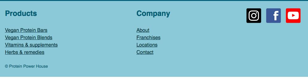
Refresh in your browser and you should see this:
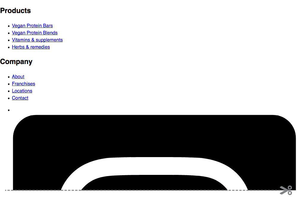
The image above is cropped because it’s really tall because of those huge social media icons.
This whole pattern we’re making today is a footer for a website, so let’s wrap it in the footer tag.
See the & code? That’s called an HTML entity. There are certain characters we cannot write in HTML because they are part of the language itself. The & entity will output an &—we can’t write & directly in our code because it’s part of the HTML language.
The other two characters we need to escape are:
< — <> — >We have two chunks of navigation in the footer, each pointing to resources on the website—like a mini sitemap.
Let’s add some social media links to the footer too. The images you need are already in the images/ folder.
We’ll wrap each image in an <a> tag so they are clickable.
It’s extremely critical we add well thought-out alt attributes to the <img> tags for accessibility, and in the event the images don’t download.
The last hunk of HTML is a <small> tag that contains our copyright notice.
Let’s add some CSS to the footer to add some colours and the basic layout. Also I think it’s a good time to get those huge social icons under control.
⋮
img {
  display: block;
  width: 100%;
}

.footer {
  display: flex;
  justify-content: space-between;
  padding: 1em 0;

  background-color: #8bc9d9;
  border-top: 3px solid #005e76;

  color: #005e76;
}

.social > li {
  width: 3em;
}
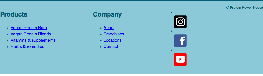
Refresh in your browser to see the basic footer—but it still needs some work.
We added a class for the <footer> tag in the HTML because it’s possible we could use more than one footer in our code, so this is more forward thinking and safe.
Turn the footer into a flex container, meaning all it’s direct children will be flex items—and by default they’ll fit on the same line.
We’ll also go ahead and add justify-content to spread them out and fill all the available space on the line.
Let’s get the size of those icons under control by setting a width of the <li> tags.
By default we always want our images to scale, so we set a width: 100% on the <img> tags further up in the CSS. But we can overwrite & control the width of the images by setting a width on the parent element.
The copyright notice is currently jammed up beside the social media icons, but we really want it below, on its own line. So let’s add flex-wrap to our CSS.
⋮
.footer {
  display: flex;
  justify-content: space-between;
  flex-wrap: wrap;
  padding: 1em 0;

  background-color: #8bc9d9;
  border-top: 3px solid #005e76;

  color: #005e76;
}

.social > li {
  width: 3em;
}

.copyright {
  width: 100%;
}
Refresh!
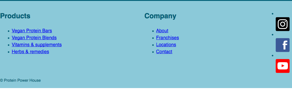
Add the flex-wrap property so that the flex items can move to the next line if they run out of space.
Target the copyright notice and force it onto its own line by giving it a width of 100%
Now we’ll make some adjustments to the typography: get rid of the bullets and their default space & add some colours to the links.
We’re even going to get the social media icons onto the same line with the addition of another flex container.
⋮
  background-color: #8bc9d9;
  border-top: 3px solid #005e76;

  color: #005e76;
}

.footer ul {
  padding-left: 0;
  list-style-type: none;
}

.footer a {
  color: #003442;
}

.social {
  display: flex;
}

.social > li {
  width: 3em;
}
⋮
⌘ Tab, ⌘R
Notice how the social media icons are now on their own line too, instead of being stacked.
Target every single unordered list inside the footer and remove their bullets by setting list-style-type to none.
We’ll also get rid of the default padding on the left that browsers set to have space for where the bullets sit.
It’s time to tackle padding and margin—our goal being to create a cohesive space around and between all the different elements so they look balanced.
⋮
.footer {
  display: flex;
  justify-content: space-between;
  flex-wrap: wrap;
  padding: 1.5rem 0;

  background-color: #8bc9d9;
  border-top: 3px solid #005e76;

  color: #005e76;
}

.footer h2 {
  margin-top: 0;
  margin-bottom: 1.5rem;
}

.footer ul {
  margin-top: 0;
  margin-bottom: 1.5rem;
  padding-left: 0;
  list-style-type: none;
}

.footer a {
  color: #003442;
}

.links {
  padding: 0 1rem;
}

.social {
  padding: 0 1rem;
  display: flex;
}

.social > li {
  margin: 0 .5em;
  width: 3em;
}

.copyright {
  padding: 0 1rem;
  width: 100%;
}
Another quick look in the browser before we move to the final step.
For the most consistent typography it’s a good idea to try to base vertical paddings and margins on the line-height—it’s called making a baseline rhythm.
For the <footer> itself, we’re going to have padding on the top and bottom equal to the page’s line-height. Since the line-height is 1.5 a padding of 1.5rem will be equal in size.
It’s also super helpful to remove the top margins from elements and use only bottom margins—we can avoid the annoying margin collapse system by choosing a single margin direction.
For the <h2> and for all the <ul> tags we’re going to remove their top margin & set the bottom margin equal to the line-height.
Finally we’ll add some nicer horizontal spacing to elements. Here we’ll target the two .link <nav> tags and add equal padding to their left & right. We’ll do the same thing to the .social icons and the .copyright notice. Now everything should align nicely.
I don’t like how the social media icons are touching each other; if we add a margin to their left & right sides we can space them out a little bit.
There are two final things I want to adjust:
⋮
.footer {
  display: flex;
  justify-content: space-between;
  flex-wrap: wrap;
  align-items: center;
  padding: 1.5rem 0;

  background-color: #8bc9d9;
  border-top: 3px solid #005e76;

  color: #005e76;
}

⋮

.social {
  margin-left: auto;
  padding: 0 1rem;
  display: flex;
}
⋮
One final refresh to see the final result of all our code!
First we’re going to tackle the alignment of the social media icons. Because our flex-direction is set to row (default) we can use the align-items property to control the vertical alignment of the flex items.
If we set align-items to center the social media icons will move down to be centrally aligned with the navigation.
To push the social icons to the far right—and force the two navigations to squish against the left side—we can set the margin-left of the .social icons to auto. An automatic margin inside flexbox can force space to be used up by emptiness, pushing the elements endlessly farther apart.
Drop the final, coded exercise into Markbot and fix all the errors until Markbot gives you all green (and maybe a little yellow).
We don’t have an <h1> in this code because this is the footer on a larger website so the <h1> would probably be somewhere else on the page.
After you’ve fixed all the problems, go ahead and submit the assignment. You’ll immediately get your grade.