We’re going to look at hand writing some SVG & CSS to create an interactive smiley face.
When hovering over the face the eyebrows will tilt from happy to angry positions.
This is what it should look like when it’s done:
Hand write SVG code to create an interactive smiley face.
We’re going to look at hand writing some SVG & CSS to create an interactive smiley face.
When hovering over the face the eyebrows will tilt from happy to angry positions.
This is what it should look like when it’s done:
Remember the purpose of this lesson is to type the code out yourself—build up that muscle memory in your fingers!
Start the lesson by forking and cloning the svg-smiley-face repository.
Fork & clone the “svg-smiley-face” repo.
The repository will have some starter files to get you on your way and include requirements for Markbot so you can be sure you’ve completed the lesson.
This includes some starter code that you can get by forking and cloning the repository. You’ll use Markbot to double check everything is done properly.
Before we get started, create some files and get ready.
index.html & add the boilerplate code.main.css in your css folder—it can remain empty.Don’t forget to follow the naming conventions.
Create the boilerplate with html5, viewport, css
Inside our HTML we’ll start by writing the code for the SVG—specifically defining the dimensions and the artboard.
⋮
</head>
<body>

  <svg class="smiley" width="256" height="256" viewBox="0 0 256 256">

  </svg>

</body>
</html>
⋮
We can add class attributes to the SVG elements.
The width & height define the dimensions of the image.
The viewBox defines the artboard in the image, a cropping zone. It’s almost always the same as the width & height.
0 0 — the top left corner’s x & y coordinates.256 256 — the width and height of the art board.Using SVG’s <circle> tag we can create the face.
⋮
<svg class="smiley" width="256" height="256" viewBox="0 0 256 256">
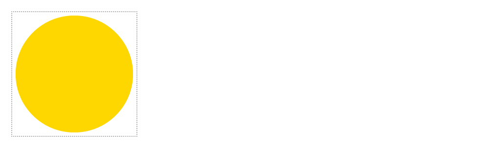
<circle class="face" cx="128" cy="128" r="120" />
</svg>
⋮
You should see a black circle when you refresh in the browser.
Here’s an explanation of the different attributes on the <circle> tag:
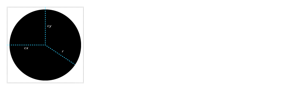
cx — the center x coordinate, measured from the left of the imagecy — the center y coordinate, measured from the the top of the imager — the radius of the circle, measured from the cx & cyNotice the closing slash at the end of the <circle … /> tag: because this is XML self-closing tags must include their own slash.
SVGs use CSS for much of their visual style—the only difference is the properties that are used to apply visual design.
.face {
  fill: gold;
}
We select things the same as with HTML, using classes or tags.
The fill property is used to colour SVG shapes.
Using two more <circle> tags we can add the eyes onto our smiley face.
⋮
  <svg class="smiley" width="256" height="256" viewBox="0 0 256 256">
    <circle class="face" cx="128" cy="128" r="120" />
    <circle class="left-eye" cx="100" cy="104" r="12" />
    <circle class="right-eye" cx="156" cy="104" r="12" />
  </svg>
⋮
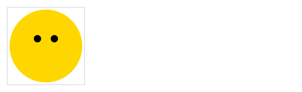
Two new circles. We don’t need to add fill because they’ll automatically be black.
Using the SVG <path> tag we can create really complex paths and shapes. We can use it now to make the smile.
⋮
<svg class="smiley" width="256" height="256" viewBox="0 0 256 256">
<circle class="face" cx="128" cy="128" r="120" />
<circle class="left-eye" cx="100" cy="104" r="12" />
<circle class="right-eye" cx="156" cy="104" r="12" />
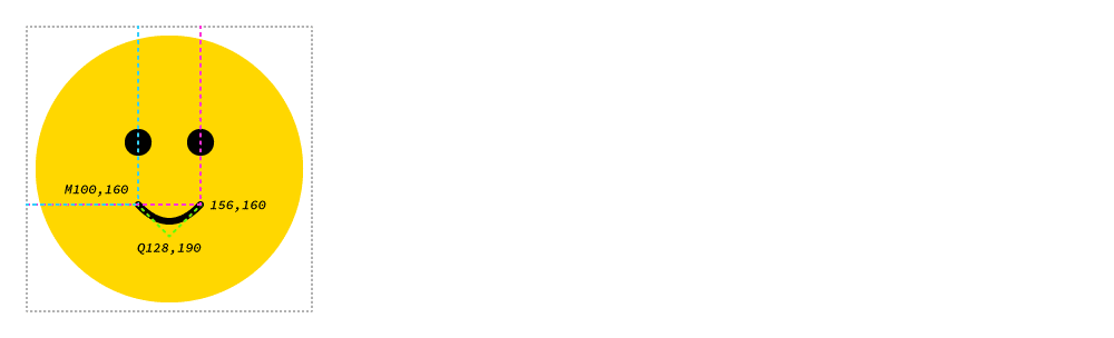
<path class="mouth" d="M100,160 Q128,190 156,160" />
</svg>
⋮
In the d="" attribute there’s a lot of complexity going on, here’s a break down of what each thing is doing.
You won’t be able to see the mouth in your browser yet.
All the fanciness for the <path> is controlled by the d="" attribute—it gives coordinates for anchor points and for control handles.
M100,160 — the starting anchor point for the path.Q128,190 — means we want to use a quadratic bézier curve, giving us only one control handle for the curve. The coordinates are the handle’s location.156,160 — the coordinate for the last anchor point.We can’t see the mouth in our SVG face yet because the path exists but it doesn’t have a defined, visible stroke. We do that with CSS.
⋮
.face {
  fill: gold;
}

.mouth {
  fill: none;
  stroke: #000;
  stroke-width: 6px;
  stroke-linecap: round;
}
Now the mouth should be visible in the browser.
The colour of the stroke on the shape.
The thickness of the shape’s stroke.
Makes the ends of the stroke into rounded corners instead of sharp edges.
Let’s use the <rect> tag to create a set of eyebrows.
⋮
  <svg class="smiley" width="256" height="256" viewBox="0 0 256 256">
    <circle class="face" cx="128" cy="128" r="120" />
    <circle class="left-eye" cx="100" cy="104" r="12" />
    <circle class="right-eye" cx="156" cy="104" r="12" />
    <path class="mouth" d="M100,160 Q128,190 156,160" />
    <rect class="left-eyebrow" x="97" y="66" width="6" height="32" rx="4" ry="4" />
    <rect class="right-eyebrow" x="153" y="66" width="6" height="32" rx="4" ry="4" />
  </svg>
⋮
This is what we should be looking at in our browser right now:

There are a bunch of attributes here to create the rectangle:
x — the top left x coordinatey — the top left y coordinatewidth — how wide the rectangle isheight — how tall the rectangle isrx — the horizontal border-radius sizery — the vertical border-radius sizeUsing the CSS transform: rotate() property we can adjust the eyebrows to look happy.
⋮
  stroke-width: 6px;
  stroke-linecap: round;
}

.left-eyebrow {
  transform: rotate(80deg);
}

.right-eyebrow {
  transform: rotate(100deg);
}
If we look in the browser right now we won’t see the eyebrows any more. It’s because transform-origin is set to the top-left of the SVG by default.
Here’s a little visualization of what’s happening right now:
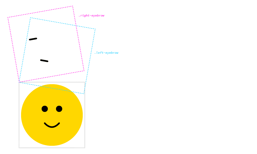
We want to get the transform-origin anchor point in the center of the rectangle, but center center doesn’t work on SVG.
So we need to use pixel coordinates instead.
⋮
.left-eyebrow {
  transform: rotate(80deg);
  transform-origin: 100px 82px;
}

.right-eyebrow {
  transform: rotate(100deg);
  transform-origin: 156px 82px;
}
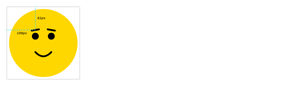
With these transform-origin properties we can now see the eyebrows exactly where we want them to be.
Here’s a little visualization of where those numbers came from:
100px, is the exact center of the rectangle measured from the left edge.82px, is the exact center of the rectangle measure from the top edge.Let’s add a little interactivity with transitions. We’re going to make the eyebrows rotate into an angry state when you hover over the face.
⋮
.left-eyebrow {
  transform: rotate(80deg);
  transform-origin: 100px 82px;
  transition: all .5s linear;
}

.right-eyebrow {
  transform: rotate(100deg);
  transform-origin: 156px 82px;
  transition: all .5s linear;
}

.smiley:hover .left-eyebrow {
  transform: rotate(100deg);
}

.smiley:hover .right-eyebrow {
  transform: rotate(80deg);
}
Try it out!
Add a transition to the default state for the eyebrows so they’ll be animated when hovered.
Read this selector from right-to-left: “choose the .left-eyebrow when the user :hovers the .smiley.
I’ve specifically done this so we don’t have to hover directly on the eyebrow for the animation to trigger, we can hover anywhere on the smiley face.
Drop the final, coded exercise into Markbot and fix all the errors until Markbot gives you all green (and maybe a little yellow).
After you’ve fixed all the problems, go ahead and submit the assignment. You’ll immediately get your grade.